Wednesday, December 25, 2013

Pre-production Planning - Cover Flatplans

Before beginning to design the Cover Page, I already had a fairly clear idea of what I wanted to include. Inspired by the focus on the letter 'A' of the masthead, I wanted to somehow incorporate the angles of the letter into the image. This shape was the foundations of the page, with cover lines fitting around it.
[Above]
Drafting the flatplan by hand, I decided to include space for 6 cover lines, however the bottom right area does look rather empty, so perhaps more could be included. I intend for the middle right text to be a pull quote to add another element to the magazine. I am going to redraw this flatplan using InDesign and further consider the elements on the page.
After digitalising the flatplan, I was able to see gaps in the design and fill them, which lead to the inclusion of a puff (the circle influenced by the original masthead) and either another cover line or space for buzz text. By complete happenstance I changed the pt of a line next to the main cover line, top left. This indentation really draws the viewers eye into the publication, and I shall keep this and change it's colour to suit the colour scheme of the page. The already conventional nature of this flatplan allows me to be more experimental in other areas, such as the main image, without appearing unprofessional. Once I vary some of the fonts of the cover lines I really think that this design will 'pop'! 

Still refining the flatplan, I was inspired by some hand-written font as well as the original serif masthead and I wanted a further focal point to the magazine. As the masthead is extra bold, I think the inclusion of a large cover line - whether it be a title of an article or the cover artist's name - would put more focus onto the content, which is perhaps the most vital part of the magazine.

Pre-production Planning - Revised Masthead

Upon sketching flatplan designs for the cover page and considering my previous decisions regarding the masthead, I decided to reconsider it's design. The factors that concerned me ranged from the communication and translation of the design to my audience as well as the visual impact which the masthead created. On reflection, I feel that the masthead's link to the music element of the magazine was also unclear, with the more grungier origins of the Alternative Rock genre being suppressed by the quite 'pretty' serif font. Whilst I really like the aesthetics of the original masthead, I think the lack of clear relevance to the genre is unsuitable, as is the general design.

Despite this, I am conscious of the inclusion of an end symbol or blob at the end of the double page spread article. I intend to translate the circular shape of the original masthead into the revised version for this purpose.


Upon adding text to the logo, I was mainly inspired by the font combinations I had been testing for the double page spread. Whilst I chose the Oswald and Open Sans combination, I still really admired the Roboto and Roboto Slab pair, as the variations of the same font will help highlight the fluidity of the design.

Continuing on from this, I mainly wanted the 'A' to be the statement of the masthead, so by placing any text to the right of the letter on the same line diverts any focus to the bolder letter. Previously, I had toyed with the inclusion of 'Mag' with the masthead, forming 'Alt Mag'. On hindsight, I don't think this portrays a more maturer magazine which is aiming to be modern, and suits more of a gossip-lead publication. Yet whenever I say Alt aloud, I naturally follow it with the word magazine, forming 'Alt Magazine'. Because of this, I want to challenge myself further to include this element.

When resizing the original pointy triangular version (bottom variation), I found it almost too large and quite distracting. Once again referring back to previous sketches, I decided to modify the masthead to a rectangular end by simply overlaying and subtracting a rectangle onto the top of the A. After making this slight change and placing it with the same text arrangement, I found the A integrated with the overall masthead much more effectively.

I was concerned that the inclusion of the word 'magazine' would prove too long, however I was pleasantly surprised with how fluid the overall combination was. By placing the text in all capitals, this meant that the x-height of the text would remain constant, maintaining clear horizontals.

After making more subtle adjustments of width and heights of the fonts, I conducted another experiment. I went about 6ft away from the computer, and tried to read the masthead across the room. Whilst I could make out some of the bolder shapes from the 'Alt', the magazine part was by far the clearest to read. Evidently, I need the name of the publication to be the most obvious, so I have made the decision to refine the masthead further and limit it to just 'Alt'.

As well as possessing clear aforementioned links to the Alternative Rock genre, the bold sans-serif font holds connotations of modernism as well as being able to be read from afar. I am also pleased that the 'A' letter was entirely designed by myself by hand, giving a personal link to the design.

Tuesday, December 24, 2013

Pre-production Planning - Font Samples

The body and header font combination for the double page spread is perhaps the most key design aspect of the page. I was concerned with readability, as well as how each font would compare against each other. I experimented with 5 fonts downloaded from Google Fonts. These included: Oswald, Lato, Open Sans, Roboto Slab & Roboto Sans.

At first, I placed three combinations on the page, consisting of: Oswald Regular & Roboto Sans Regular, Oswald Regular & Open Sans, and Roboto Sans Bold & Lato Light. The latter two from these sans-serif combinations are my favourites, with the lighter text complimenting the bolder header. I wanted to keep a sans-serif body text to maintain a sense of modernism which the publication shall possess.

From this, I wanted to see what a full page of body text would look like when paired with the header font, as the various sizes and densities of each font can limit the readability and overall aesthetics of the page.

I referred back to the original samples, before recreating the Oswald and Open Sans combination. It was by accident that I discovered how visually pleasing the all-capital lettered title looked in Oswald Regular, and decided to keep this feature to draw attention further. As to not attract away from the title but still draw attention, I lowered the pt size of the subheading and used Oswald Light. Open Sans Regular was used as the body text, and I believe the clear decrease in weights of the fonts creates a very pleasing layout. Furthermore, the complete use of sans-serif fonts reinforces the modern feel.

Upon searching Google Fonts further, I found a variation of the typeface Roboto Sans; Roboto Slab. I thought it would be interesting to combine sans-serif and serif versions of the same typeface, creating a visual interest. I like the impact of the bold title, which is furthered by the contrasting serif and sans-serif fonts. Despite this, I believe the more cleaner-looking sans-serif Oswald and Open Sans combination more suitable for my magazine.

Sample body text taken from here

Saturday, December 21, 2013

Pre-production Planning - Placement

Due to the unique circular shape of the masthead, I was concerned with the placement of the element on the front cover. I tested various placements regarding the shape, from the circle fully visible to corners not showing and even elongating the circle using a square shape. From this, I overlaid each possible combination to be refined further.

Taking my four favoured circular masthead placements, I used the original logo to create samples of how each element would effect the overall aesthetic of the page. The top left placement is my most favourite concept, as it's position in the top and left-hand third enables the masthead to be seen on a newsstand using either horizontal or vertical stacking. Although I think the text appears too squashed therefore I am going to refine the masthead further by altering the position of the text lower-down. I also like the concept of the bottom-right masthead, and perhaps with more centred text the sample would be more appealing.

After enlarging my favoured placement, I found the lower-left corner quite distracting and hard to integrate with the overall page. Because of this I decided to merge my two favourite placements and include a rectangle in the lower-left corner, creating a more consistent shape. Whilst I believe the masthead integrates well with the page dimensions, I am still not fully happy with this version. Despite overall positive feedback of the design, I still feel that the quite unconventional nature of the masthead is too distracting. The masthead and cover page should communicate a clear, recognisable brand.

Thursday, December 19, 2013

Pre-production Planning - Masthead Design

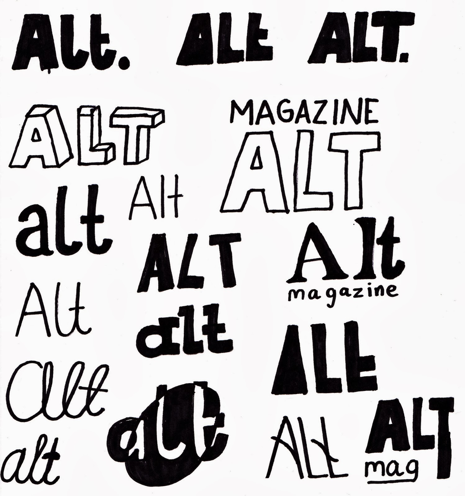
Upon deciding on the name of the magazine, I experimented with sans-serif and serif font designs by hand. I tried variations of all capital letters ('ALT'), all lower-case ('alt') and the inclusion of 'magazine'. Originally I was more enthusiastic towards the sans-serif fonts, as these have much more modern connotations, yet the contrast of the sans-serif and serif combined created an interesting composition. My main aim was for the masthead to have character and a clear brand sense, and the unique nature of the magazine to be evident.

Sans-serif: Referring back to my sketches, I followed my original plan to have a sans-serif masthead. As a masthead should stand out, I used only bold versions of each typeface, adding impact. With each font I experimented with placement of components, varying between capital letters, lower case, abbreviation to 'mag' as well as using the full word 'magazine'. Despite experimenting with 5 fonts (Futura, Oswald, Pincoyablack, Poplar Std & Vinyl Stickons) I am not fully happy with any of these designs. They appear to lack substance, being rather bland. Even with the inclusion of extended lines in the last Oswald example inspired by the first College Magazine project, none of these offer the edgy, modern look I was hoping for. My favourite of these samples is the first Oswald design due to its clean lines which create the most impact paired with subtle boldness.

Serif: Not entirely satisfied by the sans-serif samples, I looked to serif fonts both with and without cursive. Personally, I really like the cursive look of the lower-case Pacifico, Cider and Wisdom Script examples, as a clear flow along the letters is visually pleasing. The aesthetics of Birch Std and Garamond lend themselves more to fashion publications or books, rather than a music magazine. Whilst it could be argued that the sans-serif samples look more typical of a music magazine, I really like the lower-case Cider example in the middle. Considering my own preferences and the unique, niche nature of the magazine, I believe that font form the masthead.

Looking at the logo on it's own, I found it to be lost against even a plain background. Due to the lack of capital letters to draw attention to the masthead, I've experimented with some framing of the masthead. Once again after experimenting with various shapes, I found the simple circle and square most visually effective. Furthermore, once placing the text on a coloured background, I found that the masthead became very visually striking.

I used the colour dropper tool in Illustrator to pick colours featured in my Design Inspiration Mood Board featured on Pinterest. I constantly considered the use of colours and their connotations, as the masthead may be the most important aspect for brand recognition. To consider my audience further, I shall conduct a straw poll to gage popular opinion for each colour.

I also experimented with multiple colour combinations using a clipping mask to see which colours worked well together. Although I believe the results are too busy, and not suitable for the magazine.

In order to cater the masthead for my target audience, I asked 35 of my mainly female peers aged between 16-19 to gage the most popular colour combination. Number 5, the teal version, proved most popular, closely followed by the lighter purple and red examples. I want to integrate the teal design within the publication, with the colour forming part of the house style.


Above shows the final masthead designs. I was concerned about incorporating the circle into the cover layout especially, so I have created a variation of the original which could be used if problems arise. The font used is Cider-Script, and the colour hex is #336666, composed of 20% red, 40% green & 40% blue. It is also a web safe colour, making it suitable for online publications.

In Western cultures, the colour teal has connotations of communication and clarity, which can be translated into the focus on the target audience's input into the publication. Turquoise/teal is actually favoured among women, which caters well for the needs of the target audience, as well as being chosen as the most popular colour from the straw poll. 

"According to a 1964 Color and Gender study, women favored blue-green (aka turquoise) more than men. This same study found that "76% of women preferred cool colors" and turquoise is a mix of the two cool colors of blue and green." - taken from here

Wednesday, December 11, 2013

Pre-production Planning - Own Font


As I had never created my own font before, I believe it would be appropriate to include a hand-made font in the magazine. I used Fontstruct to create this font, which was quite limited in terms of creating serif fonts, although considering the modern design I want my magazine to possess, this was not a major issue. Overall, I am pleased with this typeface, and shall experiment in using it for my masthead or subheading text.
Template developed by Confluent Forms LLC; more resources at BlogXpertise