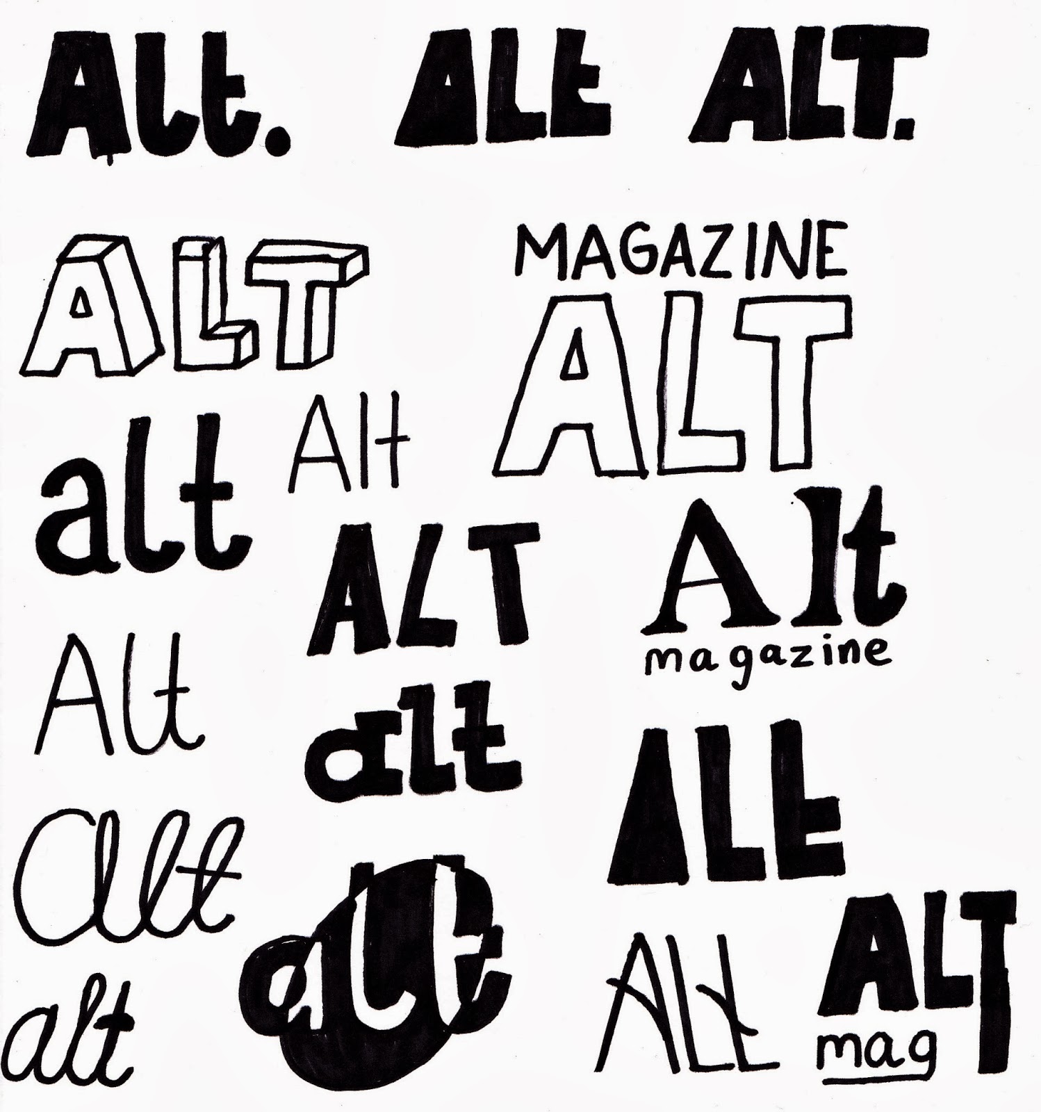
Upon deciding on the name of the magazine, I experimented with sans-serif and serif font designs by hand. I tried variations of all capital letters ('ALT'), all lower-case ('alt') and the inclusion of 'magazine'. Originally I was more enthusiastic towards the sans-serif fonts, as these have much more modern connotations, yet the contrast of the sans-serif and serif combined created an interesting composition. My main aim was for the masthead to have character and a clear brand sense, and the unique nature of the magazine to be evident.
 Sans-serif: Referring back to my sketches, I followed my original plan to have a sans-serif masthead. As a masthead should stand out, I used only bold versions of each typeface, adding impact. With each font I experimented with placement of components, varying between capital letters, lower case, abbreviation to 'mag' as well as using the full word 'magazine'. Despite experimenting with 5 fonts (Futura, Oswald, Pincoyablack, Poplar Std & Vinyl Stickons) I am not fully happy with any of these designs. They appear to lack substance, being rather bland. Even with the inclusion of extended lines in the last Oswald example inspired by the first College Magazine project, none of these offer the edgy, modern look I was hoping for. My favourite of these samples is the first Oswald design due to its clean lines which create the most impact paired with subtle boldness.
 Serif:
 Not entirely satisfied by the sans-serif samples, I looked to serif fonts both with and without cursive. Personally, I really like the cursive look of the lower-case Pacifico, Cider and Wisdom Script examples, as a clear flow along the letters is visually pleasing. The aesthetics of Birch Std and Garamond lend themselves more to fashion publications or books, rather than a music magazine. Whilst it could be argued that the sans-serif samples look more typical of a music magazine, I really like the lower-case Cider example in the middle. Considering my own preferences and the unique, niche nature of the magazine, I believe that font form the masthead.
 Looking at the logo on it's own, I found it to be lost against even a plain background. Due to the lack of capital letters to draw attention to the masthead, I've experimented with some framing of the masthead. Once again after experimenting with various shapes, I found the simple circle and square most visually effective. Furthermore, once placing the text on a coloured background, I found that the masthead became very visually striking.

I used the
colour dropper tool in Illustrator to pick colours featured in my
Design Inspiration Mood Board featured on
Pinterest. I constantly considered the use of colours and their connotations, as the masthead may be the most important aspect for brand recognition. To consider my audience further, I shall conduct a
straw poll to gage popular opinion for each colour.

I also experimented with multiple colour combinations using a clipping mask to see which colours worked well together. Although I believe the results are too busy, and not suitable for the magazine.

In order to cater the masthead for my target audience, I asked 35 of my mainly female peers aged between 16-19 to gage the most popular colour combination. Number 5, the teal version, proved most popular, closely followed by the lighter purple and red examples. I want to integrate the teal design within the publication, with the colour forming part of the house style.
Above shows the final masthead designs. I was concerned about incorporating the circle into the cover layout especially, so I have created a variation of the original which could be used if problems arise. The font used is Cider-Script, and the colour hex is #336666, composed of 20% red, 40% green & 40% blue. It is also a web safe colour, making it suitable for online publications.
In Western cultures, the colour teal has connotations of communication and clarity, which can be translated into the focus on the target audience's input into the publication. Turquoise/teal is actually favoured among women, which caters well for the needs of the target audience, as well as being chosen as the most popular colour from the straw poll.
"According to a 1964 Color and Gender study, women favored blue-green (aka turquoise) more than men. This same study found that "76% of women preferred cool colors" and turquoise is a mix of the two cool colors of blue and green." - taken from here