Tuesday, December 31, 2013

Pre-production Planning - Time Magazine


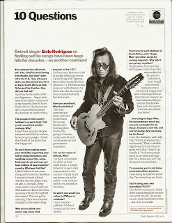
The interesting format of this interview is unique and one which could be replicated within my own publication. By limiting the interview to 10 questions, this relieves pressure on the artist to give lengthy answers, as well as providing a wealth of information for the reader. 

Constant reference to the artist's career and previous work maintains the purpose of the article; to inform. This reiterates the importance of maintaining a clear focus of the topic of the interview, as music magazine readers intend to read about music - rather than lifestyle or fashion tips - hence staying true to the genre.

Emma Watson's recorded interview with Time Magazine is interesting in many ways. As well as being physically able to see the reaction of the interviewee, the questions subtly add a comfortable pace to the interview. I intend to include interactive features, perhaps a link to either a video or podcast of my own magazine interview would add a further connection between the artist and audience.

Starting with more physical-orientated questions which have a simpler answer, to later developing more meaningful questions which require thought, the interviewee is not immediately pressured into giving lengthy answers. Furthermore, the first question focusing on appearance - "You look amazing in your new do! What made you cut it?" - addresses current news as well as being an obvious compliment, once again making the interviewee feel at ease.

Perhaps most interestingly is the origin of the questions, all of which come from fans. The inclusion of a sidebar with fan-written questions would involve the readers further, enhancing the crucial sense of loyalty with the fans which is essential for the success of the magazine. With 84% of those questioned confirming that interviews the the most important part of a magazine, I believe it is crucial to involve them in this way.

Sunday, December 29, 2013

Pre-production Planning - Dropout UK

Entitled "On The Spot" this very candid interview method is appropriate for the younger, more carefree target audience. Relaxed questions such as: "how do you start your day?", "biggest fear?", and "who do you call the most" offer interesting information which fans may not have previously known about. This very informal nature would perhaps not be entirely suitable for a full double-page spread, as the answers received are generally quite limited and not very in-depth. However this open-ended style of questioning could easily be applied within my own publication.

This has inspired me to include questions or 'quick facts' which are more for entertainment purposes to interest the reader further. From a quick brainstorm, I believe the possible feedback received from these sorts of questions is something which could be expanded upon as well as being nuggets of information;

• "Most embarrassing moment?"
• "Time you've felt most happy?"
• "Your favourite musician?"

Continuing this, considering my target audience of 16-21 year olds, similar questions relating to culture and brands which they are interested in would be of interest;

• "Are you fast at messaging people back?"
• "Favourite fast-food restaurant?"
• "Favourite thing to order at Starbucks?"

Pre-production Planning - Poses

I used a wooden model to depict some poses which I was planning to try with my real life model. By doing this exercise I was able to see which poses are more effective, as well as disregard any which would have taken valuable shooting time away.
[From left to right]
1 - I intended this pose for the cover page. Conventionally, a mid shot would be used, meaning only the headstock would be visible in the final crop. This was not my intention, so the suitability of this pose would perhaps confine itself to the contents page.
2 - The most expressive pose, this would rely on the model lifting the guitar above their head at an angle. The angle created mimics that of the double page spread, and a slight crop to a mid shot could be equally effective. I am definitely going to experiment with this pose further to see the effects I can achieve.
3 - As I want the cover page to feature the letter 'A' in some way, by the guitar facing horizontal, the middle bar of the letter is implied. This pose is my most favourite for the cover due to this reason, and one I will try to recreate.
4 - The model itself was quite limited for this pose intended for the double page spread. I wanted to have the model leaning over in the same angle of the A, looking either meaningfully to the guitar or to the camera, as if they were playing it. This gives a sense of energy which much of the alternative rock genre possesses.
5 - Proposed for the contents page, the placement of the guitar in the foreground and the model in the background offers depth, with often the whole image encompassing the forward plain. The placement of the model's hand on it's hip adds attitude which could be addressed later on in the publication in the double page spread. As the guitar is level with the head, this could connote that the artist is putting their music first. I would like to try this pose with the model using both hands and the guitar centred, which could make an interesting cover photo. Also, if the guitar was titled to the right, the same photo could be used within the double page spread, making this a very versatile pose.
6 - Quite similar to number 5, this stance is less aggressive, with the guitar firmly by their side. I don't think this pose is as expressive as the others, although this did inspire me to think about the model leaning on the guitar, offering a casual pose.

Friday, December 27, 2013

Pre-production Planning - DPS Flatplans


Originally, I had multiple ideas for the layout of the Double Page Spread. Firstly, I sketched six original designs, completely from memory. They all contain three very important elements, the title, article columns, and image.
[Going from left to right]
1 - This is a fairly unconventional layout with the image placed at the bottom, and a double page of three-column text above. I was particularly fascinated with partially overlaying the title with some subtitle text. This juxtaposition opens a wealth of opportunities, from making the subtitle partially transparent, to using contrasting colours to make either text stand out. I was planning to have the column text justified to create cleaner margins. Also, I thought it would be unique to have the model laying down stretching across both pages, adding a quirkier attitude which could be reflective of the artist's personality.
2 - More of an experiment, I wanted content to prevail over images, so included a full page of 4-column text. The top-left text box would include information about the images. I find this design too rigid for the publication, and the multiple images do not possess as much impact as a single image.
3 - Taking a more minimalistic approach, I think this layout would be more suited as an introduction page due to limited text space. I do admire the clean lines which are created from the alignment of text, and the full page image allows more creative freedom.
4 - Perhaps the most unconventional, this layout allows multiple stories and perhaps is more suited for a band offering different viewpoints. The odd shape of the image space would be difficult to work around, although the image transferring over two pages could create an interesting visual.
5 - Quite a conventional layout, I am not overwhelmed by this design. Whilst there's room for font experimentation and pull quotes, I think the design is quite limited. Once again though, the large space for the image offers a lot of freedom.
6 - Perhaps my most favourite of flat plans, the slanted image border mimics that of the letter 'A', which forms a major part of my masthead. I have multiple ideas as to how I can model the artist to incorporate this element, as well as possible ways to justify the border. The inclusion of a pull quote adds visual interest, and the large title demands attention. Furthermore, there is enough space for a full article, as well as possibilities to move various borders.

Above is my chosen flatplan for the double page spread. I adapted my sketch to include a subtitle and 3 columns, as well as moving the pull quote to the bottom and in-line with the article text, creating cleaner lines. Depending on my image (either full-shot or mid-shot) I may include another pull-quote or other text in the lower-right corner, as I did on my original draft. I used the same 'A' from the cover page flatplan, adding a sense of continuity throughout the publication. Whilst I am pleased with the overall conventional nature of the layout, I am concerned with the white space towards the top of the 'A'. This may compliment the chosen image, or could be distracting, leaving the spread look unfinished. If it is the latter, I will have to revise the border, and attempt to create the 'A' shape another way, even if it involves a transparent overlay.

Dimensions:
Column Margins: 15mm
Inner Margin: 5mm
Gutter: 5mm
Bleed: 15mm

Thursday, December 26, 2013

Pre-production Planning - Contents Flatplans


When creating my College Magazine, I designed two contents pages; an unconventional and design-focused one, and a more conventional one. Ultimately, I ended up using the conventional layout as it was familiar to the readers. Learning from this, I have sketched three designs, all of which use a conventional list and feature at least one image. All designs will feature 20 article titles.
[From left to right]
1 - The most rigid design, all 20 articles are featured in a list in chronological order. The left-hand column features both an editorial and flannel panel, which I really wanted to include. Although, I am worried that the page will look too busy, and the only way to highlight feature articles is by colour, which could have varying degrees of success.
2 - Simplified for effect with a similar design to number 1, the gaps between the article names break up the composition, but limit space. I find the inclusion of the image a slight afterthought, and overall the design a bit bland. I did consider adding texture to the bars, but this would be inconsistent with the rest of the magazine.
3 - Actually quite a minimalist design, the clear focus on images will brighten the page adding a wealth of visual interest. Whilst the article list may not be very wide, the 1 column width paired with the full page length offers enough room for clear 'feature' and 'regulars' section. Triangles derived from the letter A aid consistency whilst adding an edgy touch, reinforcing the modern feel of the publication.
Paying close attention to the triangular angles of the letter 'A' which plays a considerable part in the magazine, I included subtle varying triangles which act as a background for the featured page numbers. Adding to this continuity, the largest box at the top will feature an image of the cover star, and the others relating to their corresponding article and page number. I am concerned that I haven't included a flannel panel or editorial section, and depending on how much space the contents list takes, I may be able to place a small flannel panel towards the bottom. Should there not be enough space for this, or there is more space than anticipated, I would also like to include a social networking panel with links to online sites.

Wednesday, December 25, 2013

Pre-production Planning - Cover Flatplans

Before beginning to design the Cover Page, I already had a fairly clear idea of what I wanted to include. Inspired by the focus on the letter 'A' of the masthead, I wanted to somehow incorporate the angles of the letter into the image. This shape was the foundations of the page, with cover lines fitting around it.
[Above]
Drafting the flatplan by hand, I decided to include space for 6 cover lines, however the bottom right area does look rather empty, so perhaps more could be included. I intend for the middle right text to be a pull quote to add another element to the magazine. I am going to redraw this flatplan using InDesign and further consider the elements on the page.
After digitalising the flatplan, I was able to see gaps in the design and fill them, which lead to the inclusion of a puff (the circle influenced by the original masthead) and either another cover line or space for buzz text. By complete happenstance I changed the pt of a line next to the main cover line, top left. This indentation really draws the viewers eye into the publication, and I shall keep this and change it's colour to suit the colour scheme of the page. The already conventional nature of this flatplan allows me to be more experimental in other areas, such as the main image, without appearing unprofessional. Once I vary some of the fonts of the cover lines I really think that this design will 'pop'! 

Still refining the flatplan, I was inspired by some hand-written font as well as the original serif masthead and I wanted a further focal point to the magazine. As the masthead is extra bold, I think the inclusion of a large cover line - whether it be a title of an article or the cover artist's name - would put more focus onto the content, which is perhaps the most vital part of the magazine.

Pre-production Planning - Revised Masthead

Upon sketching flatplan designs for the cover page and considering my previous decisions regarding the masthead, I decided to reconsider it's design. The factors that concerned me ranged from the communication and translation of the design to my audience as well as the visual impact which the masthead created. On reflection, I feel that the masthead's link to the music element of the magazine was also unclear, with the more grungier origins of the Alternative Rock genre being suppressed by the quite 'pretty' serif font. Whilst I really like the aesthetics of the original masthead, I think the lack of clear relevance to the genre is unsuitable, as is the general design.

Despite this, I am conscious of the inclusion of an end symbol or blob at the end of the double page spread article. I intend to translate the circular shape of the original masthead into the revised version for this purpose.


Upon adding text to the logo, I was mainly inspired by the font combinations I had been testing for the double page spread. Whilst I chose the Oswald and Open Sans combination, I still really admired the Roboto and Roboto Slab pair, as the variations of the same font will help highlight the fluidity of the design.

Continuing on from this, I mainly wanted the 'A' to be the statement of the masthead, so by placing any text to the right of the letter on the same line diverts any focus to the bolder letter. Previously, I had toyed with the inclusion of 'Mag' with the masthead, forming 'Alt Mag'. On hindsight, I don't think this portrays a more maturer magazine which is aiming to be modern, and suits more of a gossip-lead publication. Yet whenever I say Alt aloud, I naturally follow it with the word magazine, forming 'Alt Magazine'. Because of this, I want to challenge myself further to include this element.

When resizing the original pointy triangular version (bottom variation), I found it almost too large and quite distracting. Once again referring back to previous sketches, I decided to modify the masthead to a rectangular end by simply overlaying and subtracting a rectangle onto the top of the A. After making this slight change and placing it with the same text arrangement, I found the A integrated with the overall masthead much more effectively.

I was concerned that the inclusion of the word 'magazine' would prove too long, however I was pleasantly surprised with how fluid the overall combination was. By placing the text in all capitals, this meant that the x-height of the text would remain constant, maintaining clear horizontals.
After making more subtle adjustments of width and heights of the fonts, I conducted another experiment. I went about 6ft away from the computer, and tried to read the masthead across the room. Whilst I could make out some of the bolder shapes from the 'Alt', the magazine part was by far the clearest to read. Evidently, I need the name of the publication to be the most obvious, so I have made the decision to refine the masthead further and limit it to just 'Alt'.

As well as possessing clear aforementioned links to the Alternative Rock genre, the bold sans-serif font holds connotations of modernism as well as being able to be read from afar. I am also pleased that the 'A' letter was entirely designed by myself by hand, giving a personal link to the design.

Tuesday, December 24, 2013

Pre-production Planning - Font Samples

The body and header font combination for the double page spread is perhaps the most key design aspect of the page. I was concerned with readability, as well as how each font would compare against each other. I experimented with 5 fonts downloaded from Google Fonts. These included: Oswald, Lato, Open Sans, Roboto Slab & Roboto Sans.

At first, I placed three combinations on the page, consisting of: Oswald Regular & Roboto Sans Regular, Oswald Regular & Open Sans, and Roboto Sans Bold & Lato Light. The latter two from these sans-serif combinations are my favourites, with the lighter text complimenting the bolder header. I wanted to keep a sans-serif body text to maintain a sense of modernism which the publication shall possess.

From this, I wanted to see what a full page of body text would look like when paired with the header font, as the various sizes and densities of each font can limit the readability and overall aesthetics of the page.

I referred back to the original samples, before recreating the Oswald and Open Sans combination. It was by accident that I discovered how visually pleasing the all-capital lettered title looked in Oswald Regular, and decided to keep this feature to draw attention further. As to not attract away from the title but still draw attention, I lowered the pt size of the subheading and used Oswald Light. Open Sans Regular was used as the body text, and I believe the clear decrease in weights of the fonts creates a very pleasing layout. Furthermore, the complete use of sans-serif fonts reinforces the modern feel.

Upon searching Google Fonts further, I found a variation of the typeface Roboto Sans; Roboto Slab. I thought it would be interesting to combine sans-serif and serif versions of the same typeface, creating a visual interest. I like the impact of the bold title, which is furthered by the contrasting serif and sans-serif fonts. Despite this, I believe the more cleaner-looking sans-serif Oswald and Open Sans combination more suitable for my magazine.

Sample body text taken from here

Saturday, December 21, 2013

Pre-production Planning - Placement

Due to the unique circular shape of the masthead, I was concerned with the placement of the element on the front cover. I tested various placements regarding the shape, from the circle fully visible to corners not showing and even elongating the circle using a square shape. From this, I overlaid each possible combination to be refined further.

Taking my four favoured circular masthead placements, I used the original logo to create samples of how each element would effect the overall aesthetic of the page. The top left placement is my most favourite concept, as it's position in the top and left-hand third enables the masthead to be seen on a newsstand using either horizontal or vertical stacking. Although I think the text appears too squashed therefore I am going to refine the masthead further by altering the position of the text lower-down. I also like the concept of the bottom-right masthead, and perhaps with more centred text the sample would be more appealing.

After enlarging my favoured placement, I found the lower-left corner quite distracting and hard to integrate with the overall page. Because of this I decided to merge my two favourite placements and include a rectangle in the lower-left corner, creating a more consistent shape. Whilst I believe the masthead integrates well with the page dimensions, I am still not fully happy with this version. Despite overall positive feedback of the design, I still feel that the quite unconventional nature of the masthead is too distracting. The masthead and cover page should communicate a clear, recognisable brand.

Thursday, December 19, 2013

Pre-production Planning - Masthead Design

Upon deciding on the name of the magazine, I experimented with sans-serif and serif font designs by hand. I tried variations of all capital letters ('ALT'), all lower-case ('alt') and the inclusion of 'magazine'. Originally I was more enthusiastic towards the sans-serif fonts, as these have much more modern connotations, yet the contrast of the sans-serif and serif combined created an interesting composition. My main aim was for the masthead to have character and a clear brand sense, and the unique nature of the magazine to be evident.

Sans-serif: Referring back to my sketches, I followed my original plan to have a sans-serif masthead. As a masthead should stand out, I used only bold versions of each typeface, adding impact. With each font I experimented with placement of components, varying between capital letters, lower case, abbreviation to 'mag' as well as using the full word 'magazine'. Despite experimenting with 5 fonts (Futura, Oswald, Pincoyablack, Poplar Std & Vinyl Stickons) I am not fully happy with any of these designs. They appear to lack substance, being rather bland. Even with the inclusion of extended lines in the last Oswald example inspired by the first College Magazine project, none of these offer the edgy, modern look I was hoping for. My favourite of these samples is the first Oswald design due to its clean lines which create the most impact paired with subtle boldness.

Serif: Not entirely satisfied by the sans-serif samples, I looked to serif fonts both with and without cursive. Personally, I really like the cursive look of the lower-case Pacifico, Cider and Wisdom Script examples, as a clear flow along the letters is visually pleasing. The aesthetics of Birch Std and Garamond lend themselves more to fashion publications or books, rather than a music magazine. Whilst it could be argued that the sans-serif samples look more typical of a music magazine, I really like the lower-case Cider example in the middle. Considering my own preferences and the unique, niche nature of the magazine, I believe that font form the masthead.

Looking at the logo on it's own, I found it to be lost against even a plain background. Due to the lack of capital letters to draw attention to the masthead, I've experimented with some framing of the masthead. Once again after experimenting with various shapes, I found the simple circle and square most visually effective. Furthermore, once placing the text on a coloured background, I found that the masthead became very visually striking.

I used the colour dropper tool in Illustrator to pick colours featured in my Design Inspiration Mood Board featured on Pinterest. I constantly considered the use of colours and their connotations, as the masthead may be the most important aspect for brand recognition. To consider my audience further, I shall conduct a straw poll to gage popular opinion for each colour.

I also experimented with multiple colour combinations using a clipping mask to see which colours worked well together. Although I believe the results are too busy, and not suitable for the magazine.

In order to cater the masthead for my target audience, I asked 35 of my mainly female peers aged between 16-19 to gage the most popular colour combination. Number 5, the teal version, proved most popular, closely followed by the lighter purple and red examples. I want to integrate the teal design within the publication, with the colour forming part of the house style.


Above shows the final masthead designs. I was concerned about incorporating the circle into the cover layout especially, so I have created a variation of the original which could be used if problems arise. The font used is Cider-Script, and the colour hex is #336666, composed of 20% red, 40% green & 40% blue. It is also a web safe colour, making it suitable for online publications.

In Western cultures, the colour teal has connotations of communication and clarity, which can be translated into the focus on the target audience's input into the publication. Turquoise/teal is actually favoured among women, which caters well for the needs of the target audience, as well as being chosen as the most popular colour from the straw poll. 

"According to a 1964 Color and Gender study, women favored blue-green (aka turquoise) more than men. This same study found that "76% of women preferred cool colors" and turquoise is a mix of the two cool colors of blue and green." - taken from here

Wednesday, December 11, 2013

Pre-production Planning - Own Font


As I had never created my own font before, I believe it would be appropriate to include a hand-made font in the magazine. I used Fontstruct to create this font, which was quite limited in terms of creating serif fonts, although considering the modern design I want my magazine to possess, this was not a major issue. Overall, I am pleased with this typeface, and shall experiment in using it for my masthead or subheading text.

Friday, November 29, 2013

Pre-production Planning - Magazine Name

The name of a magazine forms a brand identity which needs to be instantly recognisable from a glance at the publication. I decided to have the name of the magazine closely linked to the chosen genre of Alternative Music, highlighting the niche content to potential readers. Furthermore, in keeping with magazine conventions, the name needed to be short and memorable. By brainstorming various musical terms as well as words I associate with each genre, I have decided on 'Alt' as the name for the publication. Alt is short and snappy, as well as being pronounceable and closely related to the chosen genre. 'AltRock' was a close contender, however the shorter 'Alt' proved to be more effective.

Thursday, November 28, 2013

Saturday, November 16, 2013

Statement of Intent


Created using the iOS app Notegraphy

Primary Research - Audience Psychographics


In order to find out more about the psychographics of my target audience, I conducted another survey. The last survey was very effective and I received many responses.

Friday, November 15, 2013

Primary Research - Audience Psychographics

Due to limitations on SurveyMonkey, I could only include 10 questions within my questionnaire. As I will be producing an audience profile, necessary information such as popular consumer brands within the target audience's age group (16-21 years old). Considering that surveys have a tendency to give closed-ended answers which, whilst offering clear information, can often be restrictive and saturated.

Because of this, I decided to gather a group of 5 friends to have an informal focus group to gather qualitative research regarding which brands they like. The focus group consisted of:
• 2 females aged 16
• 1 female aged 18
• 1 male aged 17
• 1 male aged 21
This gave me an almost complete spectrum of my target audiences age range, with only 19 and 20 year olds not accounted for. Despite this gap, I was pleased with the range I achieved, as well as the level of participation.

I used an online mind map software called 'Coggle', which enabled me to gather the information that I had received during the focus group and sort it into certain categories. I found that the females offered more information regarding fashion, with price being a large consideration, hence the two categories of 'Everyday' and 'Special Occasion'. The males were less enthusiastic about fashion brands, but were more helpful with technology, offering gaming console brands as well as music technology. Both groups gave equal enthusiasm for the food and social network categories, which proved unisexually popular.

Wednesday, October 09, 2013

Evaluation Question 4

What have you learnt about technologies from the process of constructing this product?

I learnt about various file types and their uses. .PNG maintains transparency, .JPEG is what the file should be exported as to be an image, .PSD files can be opened and edited in Photoshop.

I learnt how to customise my blogger theme with a custom theme, using HTML to edit widths and aesthetics of the page. I also learnt how to embed videos and pictures, as well as add tags and create posts.

I already had existing knowledge of both Photoshop and InDesign, but I did learn some more intermediate skills which are explained in the ‘Skills Development’ tag. I shared these skills with the class, helping them with issues ranging from rasterising layers to creating shapes. In InDesign I helped more with formatting pages and assisting with grids.

Photoshop doesn't possess formatted grids which is a problem when aligning text and images. I used rulers in an attempt to keep my lines crisp and clear. Photoshop was very effective with image manipulation, allowing the use of transparent layers and other editing tools which aren't present in InDesign. When creating a front cover next time, I will use Photoshop for editing and manipulating images and text, and then export these files into InDesign to create a more structured layout.

InDesign's main strengths are the grids and columns which can be altered and formatted. This means a clearer, more structured layout which is effective especially for the contents page. One difficulty I discovered in InDesign was the image quality. Even when exporting the final product I found the image file to be of a lesser quality than the photoshop exported file. This may be down to the fact that Photoshop retains the pixels per inch better than InDesign, and next time I will attempt to transfer the final InDesign document to photoshop and compare the exported file qualities.

I was conscious to present my work creatively, utilising Issuu, Slideshare and Prezi to name a few. I had never used these programs before, and learnt to export my files as .PDF’s to save the formatting options. Prezi is an interesting presentation program which I mainly used to illustrate points.

In this exercise, I merged existing Photoshop and InDesign skills with new presentation skills using online programs.

Sunday, October 06, 2013

Contents Page Final


Revised Contents Page Flatplan

Deciding that the previous content page did not suit it's intended purpose, I drew up a new flatplan, which is more image-orientated. A smaller font size is featured, allowing more room for article insights and page numbers. Also an editorial section has been added, giving a more personal engagement between the publication and the reader.

Friday, October 04, 2013

Contents Page (NOT FINAL)

Strengths:
  • Clear main features, with extra information.
  • Continuation of house style and colours from the front page.
  • Integration of a rigid grid, encouraging accuracy.
  • Large text which is recognisable from a distance.
Weaknesses:
  • Unconventional, making the page difficult to read, as well as being unfamiliar with the readership.
  • Only image largely obscured from title.
  • Lack of page numbers/content/features
  • Overuse of large text doesn't flow with selectively large text featured on the front cover.
Personally, this piece was originally too simple, and ended up being more focused upon graphics than readability. A contents page should be easy to read and informative, and I felt that the lack of highlighted content within the page defeated the original purpose of this page. This is not my final contents page.

Wednesday, October 02, 2013

QR Code

.PNG File

Contents Page Flatplan


Dimensions used on flatplan:
  • Width: 210mm
  • Height: 297mm
  • Margins: 10mm
  • Bleed: 10mm
  • Columns: 3
  • Gutter: 5mm
These dimensions come from a modal range of data I gathered from other magazines, including: Fabulous, Cosmopolitan and 25 Beautiful Homes. As I discovered when creating the front cover, sticking to the flatplan religiously is often difficult, so I expect to make some alterations with these figures when I come to designing the contents page.

A simple flatplan allows me to express creativity further, as I am not limited by a strict guide. I decided to include three columns, leaving me the option to include a flannel panel or social media contact should I deem necessary. The title (Contents) was placed at the bottom as it is clear from the content what the page's intent is. However, should the article list be altered, I may move the title to a more conspicuous position.
Template developed by Confluent Forms LLC; more resources at BlogXpertise